
This post may contain affiliate links, which means I get a small percentage of the sale at no extra cost to you. I only recommend items I love and have had a positive experience with. Thank you!
Watch how I create interior design mood boards in Photoshop Elements, for these 3 kitchen design mood boards. Plan and pull together any space in your home by first creating a digital mood board with all your favorite design elements.
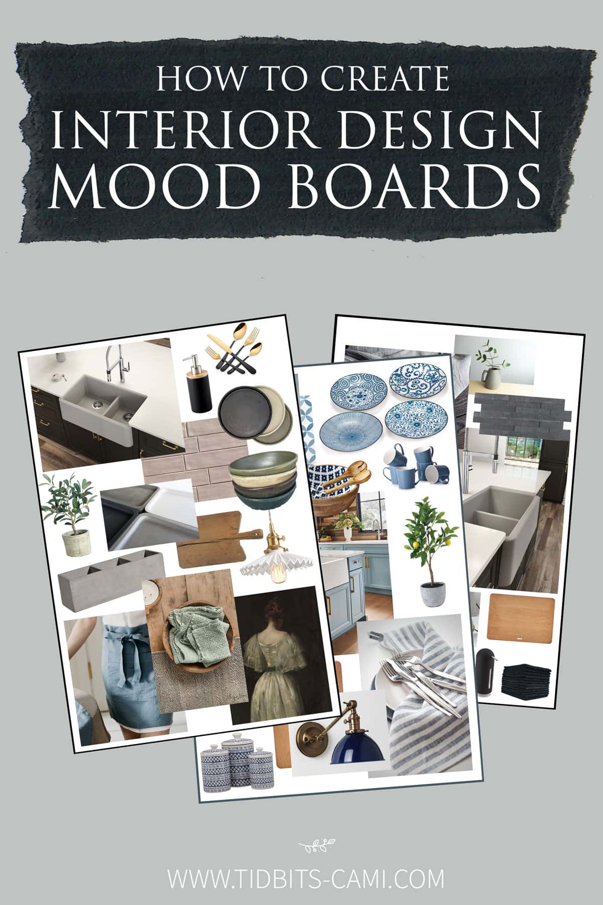
*This post is sponsored by BLANCO America, Inc. I can’t wait to show you their new sink line I used to mock up these design boards!
When the challenge came from my friends at BLANCO to create a design mood board to show how versatile their new line of neutral color sinks could be – I was as giddy as a little school girl!
Creating mood boards digitally is one of my favorite things to do! These roots go way back from when I would spend hours doing this same thing as a kid. Cutting fabric samples, pasting pictures from magazines, painting my poster board with all the best accent colors . . . ya . . . I was that kid.
Any way, I got carried away and had fun creating 3 themed design mood boards to highlight the possibilities with BLANCO’s new IKON 33″ 1 3/4 Farmhouse Kitchen Sink with low divide.
You may have seen me post all about our BLANCO 36″ Fireclay sink in our new kitchen, and I couldn’t love it any more! However, with this recently released super wide low divide IKON sink, I do have to wonder which I would have picked, had this been available when we were building.
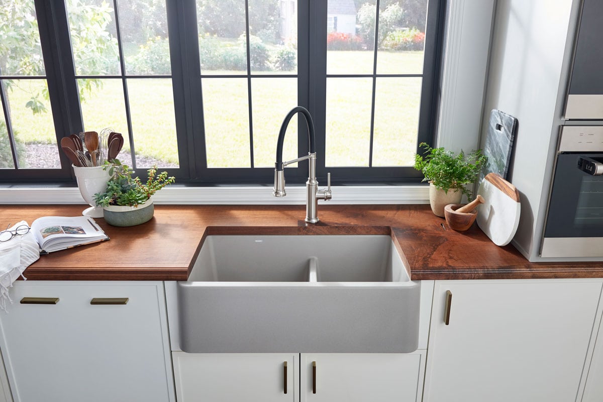
It’s the first of its kind, being an ultra wide apron front, made from their signature SILGRANIT material. We installed a BLANCO drop-in sink in our RV, made from SILGRANIT, and I adored how durable, scratch and stain resistant that material is! You really can’t go wrong with any BLANCO sink. I’ll carry that statement to my grave 😉
Some key design features of the IKON are:
- It’s designed to make prepping, cooking and cleaning a more seamless and comfortable experience for all users.
- It’s easier to handle large pots and baking sheets while still dividing the sink into cleaning and prepping bowls.
- To enhance workflow, the sink includes optional accessories, like a floating cutting board that creates another workspace and a floating grid that makes it easier to place a pot into the sink.
- The design of the sink minimizes the need to lean over as much and reduces strain.
- Comes in 8 neutral colors that work well with any design.
It’s a beauty my friends! Feel free to read more about it on BLANCO!
Let’s take a closer look at the 3 design boards I created.
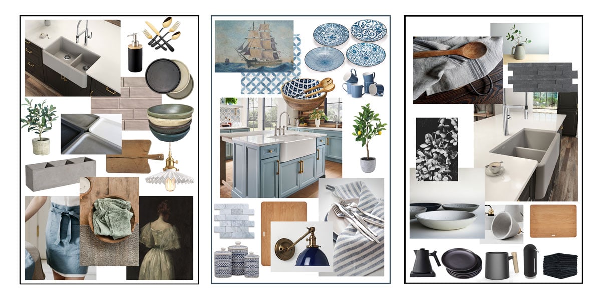
MY 3 KITCHEN DESIGN BOARDS
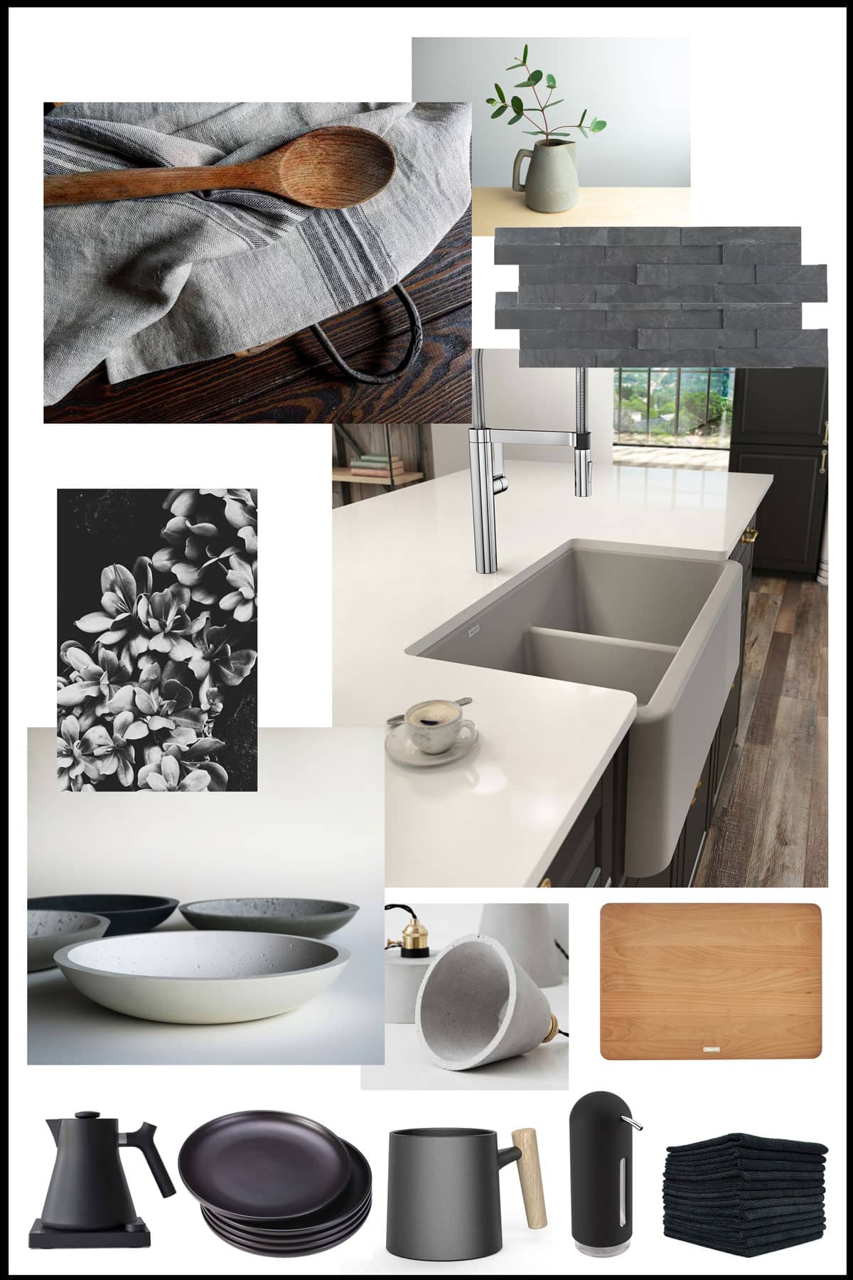
EARTHY TONES
This one, full of natural textures and muted colors is what I like to call “Earthy Tones”.
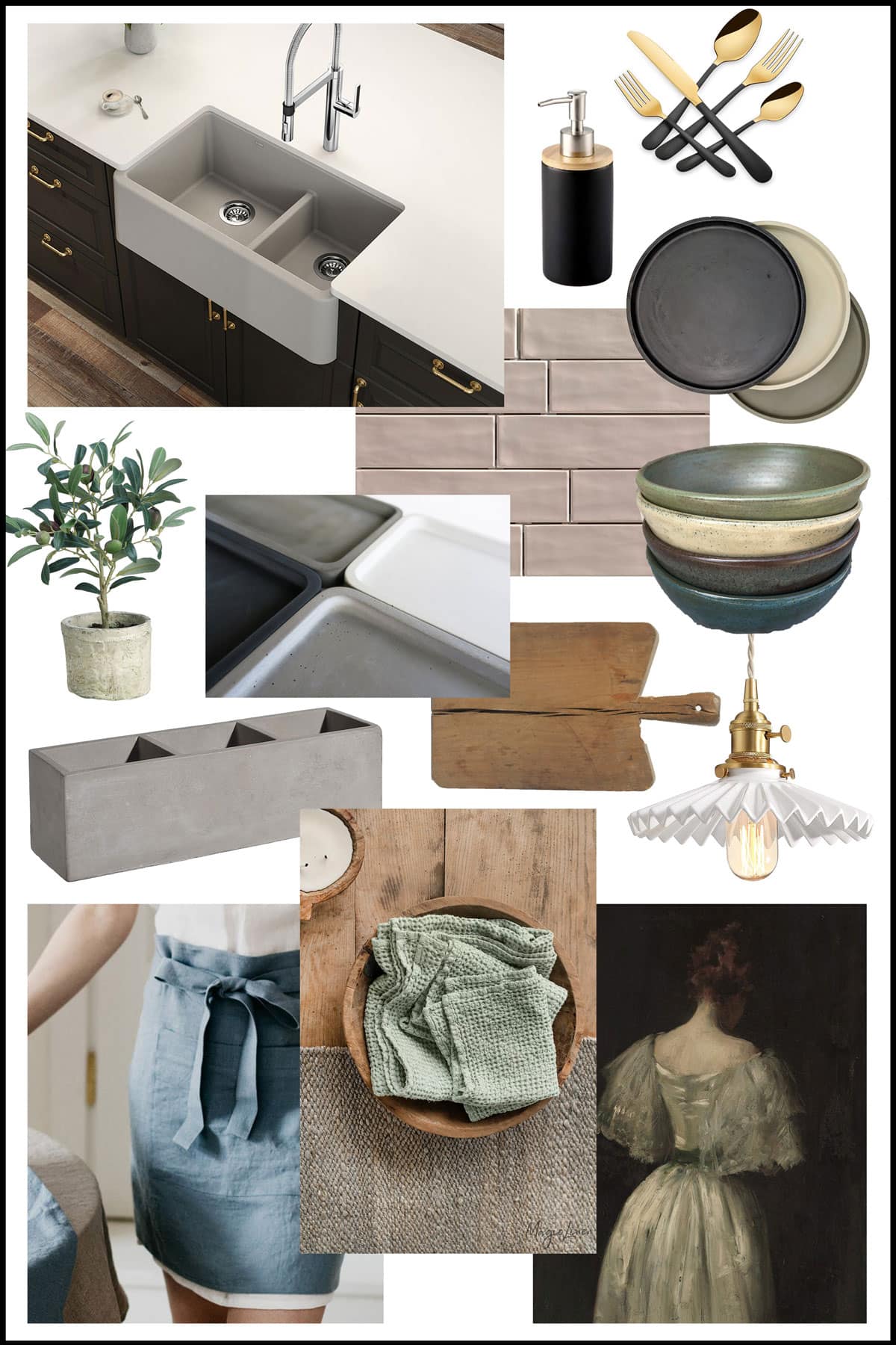
I started with the Concrete Grey IKON sink, and went from there – adding elements with raw textures and pops of muted, earthy colors.
I love the concrete grey sink and feel like it could take a kitchen in many directions. It looks good with woods, whites, and even bold colors.
SHOP THIS BOARD

FOR THE LOVE OF BLUE
I call this design mood board “For the Love of Blue”. It features the IKON sink in white – which I feel is the perfect setting for any color scheme.
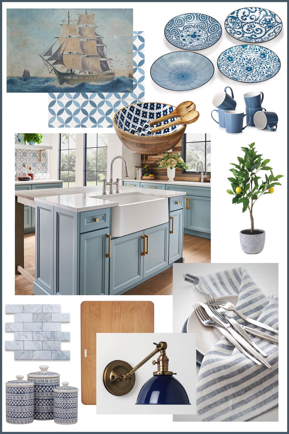
If you crave color in your kitchen, a white sink will help you play it safe no matter what accent colors you choose. You can see in my design board how I was able to pull together several shades of blue and it all plays nicely together.
SHOP THIS BOARD
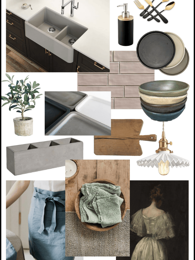
MODERN MINIMALIST
Perhaps too much color scares you (ya, I get it!). Perhaps your brain craves a very neutral, low clutter look.
I had fun creating this mood board around the Concrete Grey sink again, and I called it “Modern Minimalist”.
Black and white, and all the shades in between, create a calmness and minimalistic feel to this kitchen. A few pops of wood help warm it up while still keeping the aesthetics clean and simple.
SHOP THIS BOARD
WHICH IS YOUR FAVORITE?
And that’s the joy of creating mood boards! You can really get a feel for what elements speak to you and where to take your space. I’d love to hear which is your favorite and why!
HOW TO CREATE DIGITAL MOOD BOARDS
To show you best how to create mood boards digitally, I figured nothing would do it better than a video. I’ve created this video showing you from start to finish how I create a mood board, the program (Photoshop Elements) that I like to use, and more.
I hope you enjoyed this post and I can’t thank you enough for supporting my TIDBITS blog! I so enjoy creating do-it-yourself inspiration for you! I’ll be back soon to share some mood boards and design plans I have for my living room and master bathroom, as we begin tackling the finishing of each of these spaces.
You might also enjoy seeing these design mood boards I’ve created in the past, as we’ve planned out our spaces.
- Reader Submission Space: Traditional Farmhouse Entryway
- French Cottage Bathroom Design
- Master Bathroom Design Board


I loved the artistic pieces. Amazing article.
hi, great post! It was a very nicely written article. I like to read it. I must say that I have learnt so many things.Keep posting! Thank You.
I love the blue one! Thanks for showing us how to use photoshop elements. I’m guessing you can use this program to organize personal family photos? I’m using apple photos and I really need a way to put vintage photos together and label them individually with a caption. Would photoshop elements allow me to do this?
Yes, the blue one is so fun! Thanks for stopping by my blog Christine! I love element, and in fact took a small class on it about 10 years ago when my littles were very little and I wanted to do some scrapbooking too. It is so perfect for arranging family photos! Simple, but will work so great for those purposes. I honestly think you won’t find a better program for putting photos together and labelling them. Total creative freedom without being confusing. Please let me know if you have any questions if you get into it.
Cami, you are SO good matching everything! All the textures, colors, sizes, shapes, and blends of everything is just perfect! I love them all, but I think my favorite is “For the Love of Blue”…since blue is one of my favorite colors! Keep up the good work…we look forward to more of your ideas. I hope you and your sweet family stay safe and well through this pandemic. We’ll all get through this together!
Oh thank you Linda! I have so much fun doing! The blue one is so fun! Wouldn’t that be such a cheerful kitchen?! I’m grateful to you for reading and hope you are doing well too!